Showing posts with label SCAD. Show all posts

Wednesday, June 1, 2011

B-17 Chocolate Bar

Tomorrow is the last day of school!  Before my brain goes totally soggy for summer, here's a package design mock up I just finished (digitally).  This design is still in the comp phase, but here's a look at where it's heading.

If you take an undergraduate elective as a grad student, you're sometimes asked to do an extra project, so for Type and Image we're redesigning the B-17 Chocolate Bar packaging.  B-17 is actually pretty cool--it's a bar of dark chocolate pressed into the inner seed of an apricot kernel (the soft bit inside the pit), which are thought to help prevent cancer.  As someone who has breast cancer in her family, I'm really liking the idea of preventing it with chocolate.  (Read more about amygdalin here.)  Best of all, B-17 is really in real life looking for a new box design, so who knows, maybe this will be in grocery store near you someday.

Sunday, May 22, 2011

Thesis Show

Crystal Kanney at "Hot Hot Big Time Press" made the awesome poster (above) for the SCAD Illustration MFA thesis show that's happening next (not this) Friday, June 3rd at the Kennedy Pharmacy on Broughton St.  It's my thesis show!  Come!  If you're in Savannah and have an hour to kill before Cold War Kids play in Forsyth Park (BOTH shows will be great, I swears) please stop by.  There will be food and drink and lot and lots of great art.  On our website (made by the great Jonathan Cumberland and Stephen Wood, video by Min Ahwon) you can find links to all the artists showing:

Min Ahwon
Lauren Brown
Erin Grace Burns
Krishna Chavda
Jonathan Cumberland
Lori B. Day
Brianne Farley
Rusty Gaechter
Mike Goings
Jeff Hinchee
Sarah Jackson
Young Ju Kim
Jana LaChance
Jonathan Mayer
Blythe Russo
Lis Sartori
Bohyun Son
Angela Stork
Stephen Wood


Wednesday, May 18, 2011

Oberon for Summer


March 28th is officially Oberon Day, the day when Bell's Brewery starts serving their famous Oberon Ale.  This delicious beer is only available in the summer, so hey you know it's summer if there is Oberon (though if you're in Michigan it's probably still snowing).
In honor of my Michigander heritage (and with a shout out to my good friend Sam, Lord of the Cellar at Bell's) I picked the Bell's Oberon six pack case to redesign for my Type and Image class.
Not my image
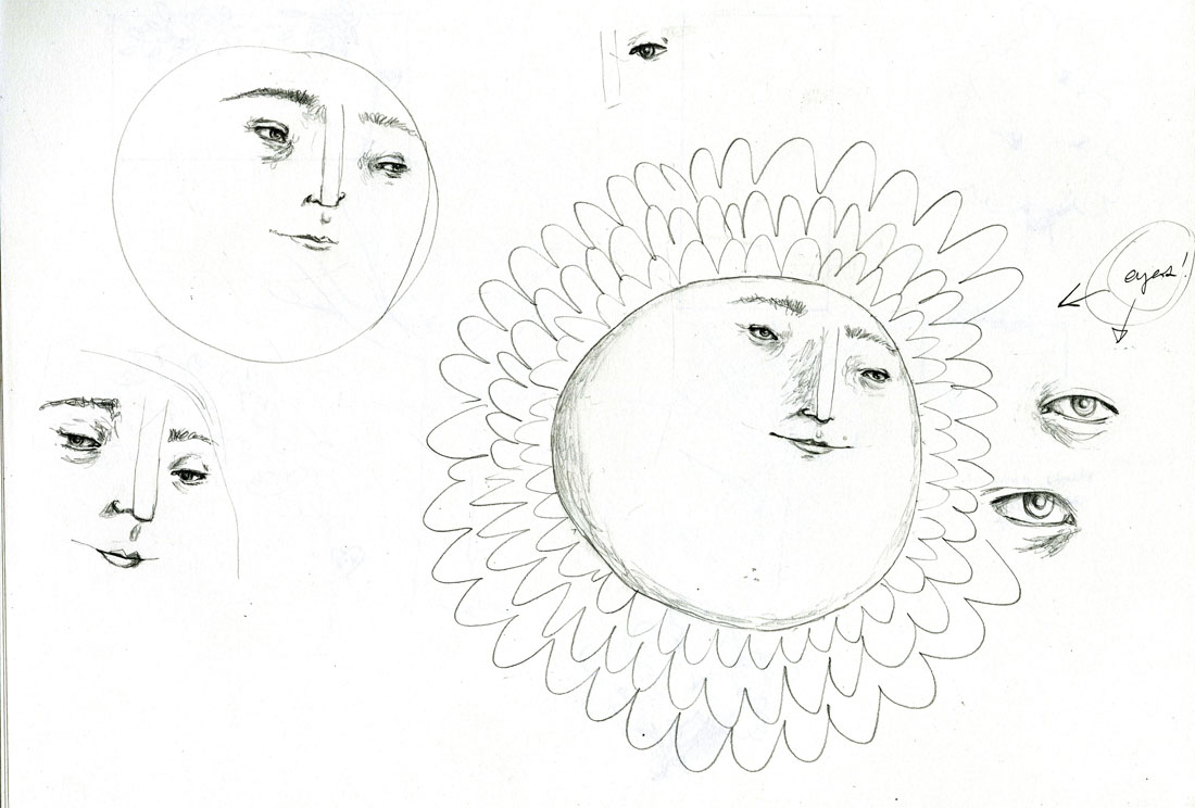
Below are some of the thumbnails I started with.  I decided to go with, roughly, the one on the bottom left (next to my million dollar idea of Edible Googly Eyes).  Then I made a collage made with beeswax and tissue paper for the sun rays, and drew the rest of the image and type with pencil, scanned it in, and colored it digitally. 
 

And here is the unfolded box with a digital mock-up I made of the folded box.  I'll be printing up and folding a dummy box next week, so I'll post that when it...er, exists.

Thursday, May 5, 2011

Henry Sugar and Six More Book Cover

I've just finished a book cover design for Roald Dahl's The Wonderful Story of Henry Sugar and Six More.  I love this book!  These are some of the sketches I started with.


Monday, April 25, 2011

More collage


I've been on a weird Nabokov kick...but not his books, his face.  I've been using it for all of my demos and experiments, when I needed a portrait of "someone," when I needed a book cover...and now I've collaged his little head.  Speak, Memory.

Friday, April 22, 2011

Illustrated Type


Last night I went to a lecture by Istvan Banyai.  He was grumpy and hilarious and showed us a ton of his illustrations.  He is very opinionated, which I like and admire, and his colors are beautiful.
A is for Apples
In other news, I'm chugging away in this Type and Image class and really loving it.  I have such respect for graphic designers (like the great Eliana Stein) who really know their type and can say so much with the placement and typeface choices.  It's incredible.  We're focusing on type and how it interacts with an image.  Right now I'm working on a book jacket (will post soon!), but I just finished these funny little illustrated letters.  That's all.  Happy weekend!
Q is for Queen
S is for Ship

Wednesday, April 20, 2011

Beeswax Collage


I tried out beeswax collage today and man, I loved it!  The tissue paper comes out super bright and I love the transparency.  I have to admit, though, I was totally thinking of Chad Kouri's work while I was working.  He makes the greatest collages evah.

Tuesday, April 12, 2011

SCAD MAT Conference

A few weekends ago I got the chance to teach a printmaking workshop with my friend Jon.  We taught "Fast and Dirty Monoprints!" (exclamation point!) to some enthusiastic SCAD professors and SCAD MAT (Masters of Art in Teaching) candidates.  It was such a great experience, and really inspired me to incorporate more printmaking techniques in my illustrations.  I forget how quick some printmaking processes are.


We taught prontoplate, trace monotype, and stencil relief printing; they are all fairly easy and don't necessarily require a press.  We mixed some colors for the conference-goers ahead of time (that's the palette above) and then brayered the ink on to some smallish, prepared beech wood sheets.  The blue-green fade on the left was made on Japanese paper with just the solid ink block.  You can make a stencil print from there by laying your stencil between the block and the Japanese paper (print on the left, stencil on the right).

Here's the demo print, above!  The orange marks and Gen. Casmir Pulaski's body are examples of trace monotype.  You lay Japanese paper onto a thin slab of ink (or an inked wood block) and draw through the back of the paper with the back of a brush, a finger nail, the palm of your hand, you name it.  Pulaski's face was made using a pronto plate.

Here's Jon teaching pronto plate technique.  Pronto plate printing is similar to lithography, except that instead of drawing on a boulder with grease, you feed a piece of treated plastic through a laser printer.  Hooray!  Then you treat it with gum arabic, bake it, and ink that baby up.

Then you can run it through a press or rub it with a baren (bah-ren) or a wooden spoon.  And you can layer all of these techniques!  Awesome.
Monday, February 7, 2011

InCharacter: Humility


Ironically, I'm posting my own illustration on a blog dedicated to my own illustrations, and this illustration is about humility.  ME I'M GREAT AT DRAWING HUMILITY CHECK IT.

Wednesday, January 12, 2011

Karen O stamp


This is what I made today. It is Karen O from the Yeah Yeah Yeahs! MMmmmmmyeahyeahyeahs. Then, I built a time machine and mailed it in the past to my future self, just like in Back to the Future.


Tuesday, December 14, 2010

SCADDYs


Exciting news! My anti-fur poster was accepted as a finalist for the SCADDYs! There's an opening Friday, January 28 from 4-6 p.m. at the Gustein Gallery (201 E Broughton Street, Savannah, GA). The awards ceremony is that same night from 6-8 p.m. at the Trustees Theater. If you're going to be in Savannah, I would love to see you there.

Tuesday, November 9, 2010

INK!

It's almost the end of the quarter, and that means my children's book is almost done! Right? Right! Ok!

I'm writing a children's book for one of my classes about a guy who wants to write a book, but he can't think of anything to write. He figures that the problem is the ink he's trying to write with; it's just not up to snuff. So he goes on a mission to make his own ink. Here a few pages I have so far. (Click to view larger.)


Friday, November 5, 2010

Atlanta Magazine

Here is my process for Atlanta Magazine for an article about how kids who get time to play during the day do better in their academic work. THAT'S why I like kickball on the weekend. Now I know.

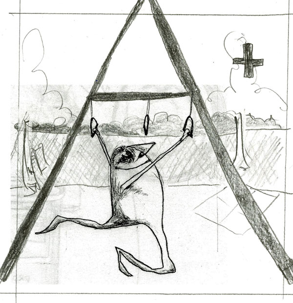
I started with the sketch below. But the little dude was just too weird for editorial work, I guess, because the art director asked if it was a frog. HA!

So I ended up with this guy. It is inked by hand and colored in Photoshop.

Thursday, October 7, 2010

Colonel Windpipe's Musical Brigade


Meet the color guard for Colonel Windpipe's Musical Brigade. Colonel Windpipe started out as a project on a blog in which a few illustrators were drawing members of a fictional marching band. Then, they received so many submissions they moved to a flickr account, where you can see the hundreds of characters people have posted. The only requirements are that the characters have a red jacket, gold buttons, be marching to the left, and be on a white background. Any one can submit, so, you should! Yeah, you.

Monday, October 4, 2010

What's Up? Annapolis

It happened again! This week is, and last was, so, so insane. I liked the ideas for the sketches I submitted to What's Up? Annapolis in Publications, but I had hoped to spend more time gussying them up.

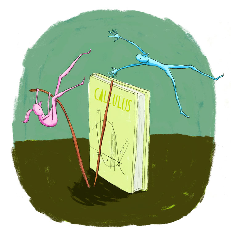
The first is for an article that they described as questioning if there is a gender gap in math ability, and the second article shows that kids who have later school day start times are more successful in school. Good morning, zombie. We were given short descriptions of the articles rather than full text, so we really had a ton of room to play. They picked 12 illustrations from our class. Here is the one I got to take to final.

Saturday, October 2, 2010

Bay State Parent

It's the second year of grad school, and that means it's time for the Publications class. In this class, a magazine sends a request for an illustration--often for a particular article--to our professor, and everyone in the class submits a sketch to the magazine. The magazine then chooses which illustration they will use in the magazine and then that person takes their sketch to finish, and their illustration is printed.

On the first day of class everyone sat down, ready to receive our syllabi and run, only to find out he had received a last minute request from a Bay State Parent magazine and needed our sketches submitted that day.

I frantically kicked out a couple of ideas and submitted two sketches. I don't know how, but they ended up picking it, so I got to take it to finish and it will be in their next issue! Above is the sketch and below is the finished illustration.

Tuesday, September 7, 2010

welcome back new kiddos

I'm back in Savannah for my second and final year of grad school! So many people are back already and it's been great to see everyone again. It's like Chicago was just a(n awesome) dream.

This Thursday is orientation for the new grad students, and my friend Lis (check out her amazing collage-y illustrations) cooked up a welcome for them. She asked the second years to send her self portraits, which she's going to hang up in the grad room with our name and hometown, etc. Cute. This is what I sent her: