Showing posts with label hand lettering. Show all posts
Wednesday, January 15, 2014
Harpy New Year!
Harpy New Year, everyone! I hope you are looking forward to a creative 2014. To ring in the New Year I launched an Etsy shop (click here) where you can buy archival giclee prints of my illustrations, including pages from Ike's Incredible Ink. The listings in the shop are really just suggestions. If you see something on my portfolio site that you'd like printed, or you have a specifically-sized art-shaped hole in your life, message me and we'll talk about custom print options.
Wednesday, May 18, 2011
Oberon for Summer
March 28th is officially Oberon Day, the day when Bell's Brewery starts serving their famous Oberon Ale. This delicious beer is only available in the summer, so hey you know it's summer if there is Oberon (though if you're in Michigan it's probably still snowing).
In honor of my Michigander heritage (and with a shout out to my good friend Sam, Lord of the Cellar at Bell's) I picked the Bell's Oberon six pack case to redesign for my Type and Image class.
![]() | |
| Not my image |
And here is the unfolded box with a digital mock-up I made of the folded box. I'll be printing up and folding a dummy box next week, so I'll post that when it...er, exists.
Thursday, May 5, 2011
Henry Sugar and Six More Book Cover
I've just finished a book cover design for Roald Dahl's The Wonderful Story of Henry Sugar and Six More. I love this book! These are some of the sketches I started with.
Friday, April 22, 2011
Illustrated Type
Last night I went to a lecture by Istvan Banyai. He was grumpy and hilarious and showed us a ton of his illustrations. He is very opinionated, which I like and admire, and his colors are beautiful.
![]() |
| A is for Apples |
![]() |
| Q is for Queen |
![]() |
| S is for Ship |
Saturday, March 12, 2011
Stationary
Finals week is always crazy, but it's even crazier when you're designing all of your branding! This class is really preparing me for life as a freelance illustrator. It's pretty exciting. My postcards came in a few weeks ago and my resume, stationary, and business card are finally done.
Here is the logo I designed that will go on my stationary.
I had even had a stamp made of this little dude.
I'm also finishing up the design for a fortune teller I'm making that will go out to art directors. Tomorrow I'm screen printing the design and folding it up. And then I'm done...?
Here is the logo I designed that will go on my stationary.
I had even had a stamp made of this little dude.
I'm also finishing up the design for a fortune teller I'm making that will go out to art directors. Tomorrow I'm screen printing the design and folding it up. And then I'm done...?
Tuesday, December 14, 2010
SCADDYs

Exciting news! My anti-fur poster was accepted as a finalist for the SCADDYs! There's an opening Friday, January 28 from 4-6 p.m. at the Gustein Gallery (201 E Broughton Street, Savannah, GA). The awards ceremony is that same night from 6-8 p.m. at the Trustees Theater. If you're going to be in Savannah, I would love to see you there.
Friday, September 10, 2010
The Good The Bad & The Ugly


Thursday, August 26, 2010
durn technology: a paper stencil screen print
Yesterday I received in the mail one! CS5! software disc! of my own!
This is after an awful week in which a deadline for an illustration for my dream publishing house intersected with the unexpected end of my free Photoshop trial. Long story. Suffice it to say that it ended semi-triumphantly in the General Access Lab of SAIC (How did I get in without an ID? Magic?) where I scanned a gouache illustration painted on screen printing paper. Some paper-lover out there is reading this and a tear is trickling down his or her cheek. GOUACHE ON SCREEN PRINT PAPER? Ayeyaiyaiyai.
So my Photoshop arrived the day after my deadline and I wanted to make out with it and throw it across the room at the same time. However I did neither. I just decided to do my next poster--it's for an upcoming SCAD Illustration gallery show at Desotorow called "The Good, The Bad, and The Ugly"--by hand.

Here are my supplies! Black paper, an X-acto knife, bitchin fluorescent pink ink (hm wait, that's for a different project) and gold leaf. More on that later.
Tuesday, May 25, 2010
boring store posters
This is what I came up with for a poster set assignment: posters for my favorite non-profit, 826CHI aka The Boring Store. The first poster is for their fund-raising event, Scrabble for Cheaters (it's hard to see on the screen, but that "A" is mysteriously worth 500 points). Check out the information about the event here. And check out the 826NYC chapter's Scrabble for Cheaters event here. Their web design is fantastic.
Almost done with the second poster!


Almost done with the second poster!
Wednesday, April 28, 2010
dirty projectors
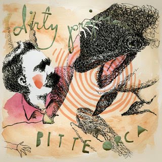
I love the Dirty Projectors. I love their new album Bitte Orca. I love that they chose the name "Bitte Orca" because they thought those words sounded nice together. In the spirit of their experimental sound, yodelling squeals, and the fact that they noted Friedrich Wilhelm Nietzsche as an inspiration, I made these thumbnails for my CD cover project.


For the final, I quickly blocked in color with very diluted gouache and watercolor, and then went over it with ink via nib pen. I then used a practice stencil I had made for the Float poster (see the earlier post) and dabbed in some more watercolor. Those are the funny blotchy textures you see in the sepia background. After all this, I cut the words out with a trusty X-acto and scanned the paintingstencil in with a piece of crumpled tissue paper behind it. Those orca sound waves were added digitally. I'm disappointed with the legibility of the word "projector" in the final, but it's easily fixed! My professor Megan Berkheiser made the brilliant suggestion to light the piece from behind and photograph it. She has a lot of experience with photography; check out here AMAZING work here. I'll be sure to post the results.


For the final, I quickly blocked in color with very diluted gouache and watercolor, and then went over it with ink via nib pen. I then used a practice stencil I had made for the Float poster (see the earlier post) and dabbed in some more watercolor. Those are the funny blotchy textures you see in the sepia background. After all this, I cut the words out with a trusty X-acto and scanned the paintingstencil in with a piece of crumpled tissue paper behind it. Those orca sound waves were added digitally. I'm disappointed with the legibility of the word "projector" in the final, but it's easily fixed! My professor Megan Berkheiser made the brilliant suggestion to light the piece from behind and photograph it. She has a lot of experience with photography; check out here AMAZING work here. I'll be sure to post the results.
Tuesday, April 27, 2010
today is brought to you by the letter S
One of my esteemed colleagues, Mark Eberhardt, has revived the SCAD Graduate Illustration blog. To celebrate, he asked the current grads to create a new masthead by making one letter each. I picked "S," and ended up making two.
This one is gross and hilarious. But flying stamp man was chosen instead.
Tuesday, April 13, 2010
float poster
Right now I'm working on a poster for SCAD film student Andy Trimbach's senior film. From what I've seen, this 12 minute film looks like it's going to be beautiful--you can watch the teaser here. Without giving too much away, it's about a little boy who ties his hopes to the sighting of an ivory-billed woodpecker.
Andy and I settled on the idea of a boy floating upside down inside the image of a woodpecker. Since he wants to hand screen-print the final poster, I decided to start with the traditional mode of screen printing: a stencil. The stencil below was cut from vellum.

I scanned this in and set about laying out the final image digitally. When I'm finished I'll convert the image to black and white stencils and screen print the poster. So, it won't look exactly like the digital version. It will have that great element of human error to it.


Subscribe to:
Posts (Atom)